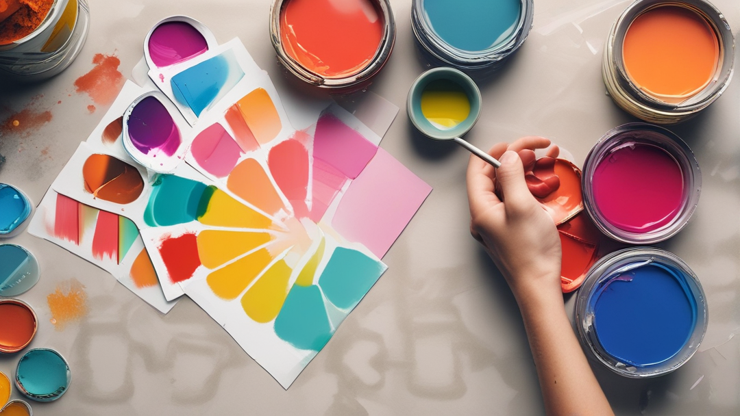
Colors play a significant and undeniable role in our everyday lives. They influence our decisions, emotions, and even behaviors in various ways. In website design, choosing the right colors can make a substantial difference in the user experience and overall success of a site. This article explores the importance and psychological impact of colors on user emotions and behavior in website design.
The Importance of Colors in Website Design
The selection of colors in website design goes beyond mere aesthetics. Colors can evoke emotions, set a mood, and even affect how users interact with a website. Each color conveys a particular meaning or feeling, and understanding this can help designers create sites that resonate more deeply with their target audience.
How Colors Affect User Emotions
Understanding the psychology of colors allows designers to make more intentional and targeted decisions in their website color schemes. Here are some common emotional associations with different colors:
1. Blue: Calmness and Trust
Blue is one of the most popular colors in website design. It is associated with feelings of calmness, trust, and stability. Many reputable brands, particularly in finance and healthcare, use blue to convey security and reliability. If you want to create a site that users feel safe and confident navigating, blue is a great choice.
2. Red: Excitement and Energy
Red is known to evoke strong emotions, including passion and excitement. It can prompt users to take immediate action, which is why call-to-action buttons like “Buy Now” or “Sign Up” are often red. However, too much red can also create feelings of pressure or urgency, so it should be used strategically.
3. Green: Balance and Nature
Green is typically associated with nature, growth, and health. It is calming and works well for websites focused on the environment, wellness, or sustainability. Green is also effective for creating a sense of balance and reassurance.
4. Yellow: Happiness and Optimism
Yellow is the color of joy, optimism, and energy. It can grab users’ attention and create positive emotions. However, using too much yellow can cause fatigue or anxiety, so it’s best used as an accent color to highlight key elements on the page.
5. Black: Power and Luxury
Black is often linked to sophistication, luxury, and power. It’s commonly used by brands that want to convey high-end, premium services or products. However, overusing black can make a website feel heavy or uninviting, so balance is key.
6. White: Simplicity and Clarity
White represents purity, simplicity, and clarity. It’s a favorite in minimalist and modern web designs. White space helps users focus on the content and improves readability, making for a cleaner and more user-friendly experience.
How Colors Influence User Behavior
Colors don’t just affect how users feel—they can also influence their actions. For example, warm colors like red and orange tend to encourage faster decision-making and immediate actions, which is useful for e-commerce sites or landing pages. On the other hand, cooler colors like blue and green create a more relaxed and thoughtful browsing experience, which is ideal for informational or educational websites.
The overall harmony of a website’s color scheme also affects trust and credibility. If the colors are poorly coordinated or too overwhelming, users may feel confused or even distrustful, leading to a negative user experience.
Tips for Choosing the Right Colors in Website Design
To effectively leverage colors in website design, consider the following tips:
1. Know Your Audience: Different audiences may respond to colors in varying ways. For example, younger users may prefer bold, vibrant colors, while older users might feel more comfortable with muted, subtle tones.
2. Use a Limited Color Palette: Stick to a simple, cohesive color palette to keep your design clean and organized. Using too many colors can be distracting and negatively impact the user experience.
3. Pay Attention to Contrast: Ensure there is enough contrast between text and background colors to improve readability. High contrast helps users quickly navigate your content and improves accessibility.
4. Test and Optimize: Experiment with different color choices for key elements like call-to-action buttons to find the most effective combination for driving user engagement.
Conclusion
Harness the Power of Color to Elevate Your Website
By carefully selecting and employing colors in your website design, you can create a powerful and engaging online experience. Colors have the ability to evoke emotions, influence decisions, and drive user behavior. By understanding the psychology of color and applying these principles to your website, you can:
Build trust and credibility: Convey professionalism and reliability through the right color choices.
Increase user engagement: Encourage visitors to stay longer and take desired actions.
Enhance brand recognition: Create a memorable and distinctive online presence.
Ready to transform your website with the power of color? Our expert team can help you develop a visually stunning and effective design that resonates with your target audience. Contact us today to discuss your project and learn how we can help you achieve your goals.